
What is LinReg and how can I get it?
Note: This is not meant to be an advertisement. I was in no way solicited by, nor am I affiliated with, the creator of the program. This is a recommendation and love letter about a tool that has made a huge difference in my classes this year.
Here is the link to the page where you can download LinReg. Scroll down just a little bit; it is under “For All Units”.
LinReg is a free program created for use with Thomas A. Moore‘s Six Ideas That Shaped Physics series of books. Versions for Mac, Windows, and Linux. I can only vouch for the Mac version, but I’d guess they’re all just as good.
I found it this past summer either through the Global Physics Department talk or through John (see the mention in his Physics Teacher Camp post). I was anxiously looking for an alternative to Excel for my Honors Physics students. Excel was overwhelming to them, made them dread doing experiments (even though they don’t write lab reports), and took seemingly endless amounts of time (with lots of repetition) to help them learn to do any of the non-intuitive things they wanted to do to analyze and graph their data. Worse, I wasn’t even having my regular Physics! students try to graph data on a computer, nor was I ever asking them to linearize any graph.
As soon as I saw it, I thought LinReg might be the answer. After using it for the whole school year, I’m pretty well sold on it. I’m writing this post to pass on the word of the program (and to hopefully hear some further tips or ideas from readers about graphing/data analysis with high school physics students).
Examples of student graphs made this year
Before I get too far into it, I should post a few examples of what my students have produced using LinReg so far. I grabbed the first few that I could find off of the classroom computers.
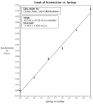
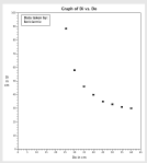
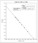
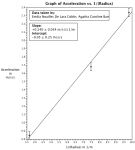
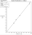
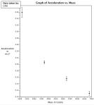
Click any of the images to open the gallery and see the full-size version.
LinReg Walk-through
Names screen
As soon as they open the program, students are immediately invited to get started using it because the screen presented to them asks for information that they know and expect to use.

If students try to dodge the first screen (usually because they aren’t sure what they are graphing for some reason), it prompts them to fill it out anyway (there’s really nothing to do until you’ve decided what you’re graphing anyway, right?).

Data screen
The next screen lets students enter their data. The two major columns are already titled with the variables and units entered on the names screen, so the next step is clear. Even though there is a lot of other information on the screen, students immediately focus on the data table and begin entering the values they’ve measured.
If they have paid attention to the range of their measurements along the way, they already know what to enter in the uncertainty columns. If they haven’t, the blank space prompts them to start thinking about how well they know each number.

As soon as they have entered their data, they are eager to press on to the graph tab at the top of the screen so they can see what they’ve got to work with now.
Graph screen
On the graph screen, they see their data with range bars in a window that fits the data but does not necessarily include the origin of the graph (which I like, because it helps them make a conscious decision to look at the axes and think about what they are seeing instead of always assuming that graphs are showing them the first quadrant precisely).

A good next step is to change the window to show the origin of the graph. The first thing that almost every group does, though, is hit the “Do Linear Fit” button. And the next thing that almost every group does is exclaim, “No! Why did you do that??” Well, that’s the next step if the graph is pretty obviously not linear, since there doesn’t seem to be an easy way to then “Undo Linear Fit”, and now they have an ugly line across their beautiful, nonlinear data.
At any rate, they’re now ready to look at the shape in front of them and start deciding on the likely “function family” or “parent function” or “type of graph” or “shape” (or whatever else their math teachers have called it or whatever else they think their math teachers have called it).
Linearizing the graph
The ultimate goal is to end up with a linear graph (maybe even a directly proportional graph) so that we can state the relationship between the two quantities we measured in our experiment. The graph above looks like a parabola, so our suspicion is that 
Flipping back to the data screen, we get to the best part of using LinReg. The steps to graphing our new quantity (speed squared instead of speed) are much more straight-forward than in Excel or any other spreadsheet program. We tell LinReg that we want to graph data calculated using an expression that we specify (which needs to use the name of the variable that you gave it on the names screen). The default is always the natural log of the variable (something we would never actually want in my class). Even though they have to change what is already there, I like that the default exists (giving a nice prompt about using the variable name instead of something silly like “x”), and I like that the default is useless in every experiment we do (so they always change it and never start to think that the program will automatically calculate what they need).

While entering the expression, the data will disappear. Do not panic! It just hasn’t been told what to calculate yet, so it is waiting. The original data is still safe (just hidden). When you finish writing the expression, press enter to prompt the program to calculate the new values. If there are any problems with the expression written, it will give you an error with a hint about what is wrong (most commonly it is a problem with the name—see the other tips section below).
Students are interrupted when heading back to the graph tab by a cue to enter new units for the calculated quantity.

I’ve seen students push cancel 4 or 5 times without reading the words (usually only on the first occasion they have tried to linearize a graph in LinReg). Eventually, they will decide to find out why they can’t get back to the graph tab, and they will realize that they know how to answer the question posed in the pop-up box.

Our suspicion about the relationship seems to be confirmed. That data looks darn linear, now! In fact, now seems like an appropriate time to throw a line onto it with the “Do Linear Fit” button.

It’s also a good time to check out the fictitious teams. These teams show alternate sets of data that are created randomly within the ranges of each datapoint that was inputted. Here’s a more specific quote about it from the website where you can download LinReg.
The program also computes the uncertainty of the slope and intercept of a fitted line using the following robust method. It first creates a large number N of hypothetical data sets, where each datum is randomly perturbed from its specified value so as to fit a gaussian distribution with a width consistent with that datum’s specified uncertainty (these sets may be displayed to illustrate the process). The program then calculates the least-squares fit to each hypothetical data set, and the uncertainty of the slope and intercept is estimated from the N hypothetical slopes and intercepts thus generated. This method gives a good estimate of the uncertainties (and makes fewer assumptions) in a very broad range of practical circumstances.

Drag through the display bar and see the range of your measurements more clearly. Get a better sense of whether or not the graph shows a directly proportional relationship. Feel a sense of accomplishment as you achieve the objective of your experiment (to find a relationship between, in this case, acceleration and speed).
Other tips
Before changing the window size (max and min of the axes), save the file. If you change the max and min to be the same value (or some other impossible-to-show combination), the program will shut down.
One-word names for variables seem to work the best when writing expressions for calculations. You can go back to the names screen at any time (even after graphing or while in the middle of writing an expression) to change the names.
There are a few other features that my students haven’t used this year, but which look really intriguing. I’ll probably get some students to try them out next year since I’m only really looking into them now (a product of writing this post). On the graph screen, there is a way to change headings (etc) by clicking the “Edit Graph Labels” button.

There are also a couple of special ways of entering more sophisticated data. One is a tool for dealing with multiple trials of each data point (my students usually just averaged them and found the range on their own before inputing the data). This feature is accessed by pressing r while in the data table.

The other can be accessed by pressing = in the data table. It lets you specify that the item you want to plot wasn’t a quantity you measure, but should instead be calculated using quantities you did measure.

I think I missed these features because I was only testing the program this summer using imaginary data for position and time, not by actually taking data myself. I must have ignored the helpful hints column on the right side of the data screen. I’m excited to try them out next year, though!
Reasons to love with LinReg
- It prompts students to talk about uncertainty and range in their data as an expected component of graphing (not an extra, confusing step that is done after graphing).
- It is dead simple and intuitive for students to use.
- Students totally view it as a tool. Not a burden. Not a checkbox. I’ve never seen them react to any physics technology in quite this way. In the Honors class (which has done much more, and therefore much more graphing, than the regular class), students immediately think of using it when they have data in front of them. They pull it up on the lab computers without any cue from me to do so, and making it through to the final, linearized graph only rarely requires any help or direction at all from me.
- It is meant to do exactly (and only) what I want it to do. Unlike Excel, it doesn’t have endless options and a main use that is different from how we’re using it. It guides them down the correct path (by not offering others), but it puts the physics burden of thinking on the student (Excel seemed to put mainly a technology burden of thinking on the student—almost all of the work was figuring out how to make Excel do anything at all, rather than immediately jumping into thinking about the relationship shown by the data and what to do with the data next). Students are still doing all of the (important) driving in handling the data. They don’t get multiple choices on what functions they can use. They have to do the physics parts themselves.
- It considers units an important currency. The program throws up roadblocks at more than one step when students try to streak through the graphing process with naked numbers. It puts units on the slope and intercept. It calls the axes horizontal and vertical instead of confusing the meanings of x and y (which we only use for horizontal and vertical position).
All of that being said, this program is certainly not the right tool for every use or every class. There are merits to having students stumble through learning Excel, to using a Vernier or Pasco data-taking program, and to graphing by hand (something my students still do for some tasks, especially at the beginning of the year). I have a feeling, though, that many who read this blog will find it to be a near-perfect fit for what they want students to be able to do in first-year high school physics classes. If you’re convinced and what to try it out yourself, just scroll back on up to the first part of the post (What is LinReg and how can I get it?) to start.


Have you ever used Logger Pro from Vernier. It seems to work well. I will give this a try. I am always trying to find a better way to graph.
We use Pasco sensors, so I haven’t played much with Logger Pro. When you try LinReg, let me know how it compares from a student-use point of view.
We use Pasco sensors as well, however, I find my students do not like using DataStudio. Who am I kidding, I don’t like it either. Anyway, I will try it out snd see what they think.
[…] blog I only recently subscribed to (Physics! Blog! by Kelly O’Shea) had a very nice plug (LinReg for physics class data graphing) for a graphing program I’d not heard of before: LinReg which is available free from […]
[…] them. Primarily, I had students download & install LinReg (an excellent graphing program- see Kelly O’Shea’s excellent post on why), sign up for Google Docs (or Drive, or whatever), and provide their user information for […]
[…] also found a good walk-through and tutorial in using […]
[…] the equations into a good format (using meaningful symbols, getting rid of the +/- we learned about from using LinReg, and putting units on our slopes), then ran out of time for the actual board meeting. The boards […]
I just tried it and I can’t wait to use it in class — WAY easier than Excel, it makes the kids think about uncertainty (which mine don’t do unless I force it!) and instead of just spitting out the formula for the best fit line, it gives the slope and intercept. The kids have to take those numbers, think about what they mean, and write the equation from there. For many this is automatic already but some really need the extra bit of thinking it makes them do!
Yay! 🙂 Let me know how it goes. I’m about to try out some of those extra features that I didn’t use last year with this year’s class (as the regular Physics students begin an investigation that will result in ideas about momentum transfer).
Has anyone found a phone app just like LinReg? My kids would definitely use their phone/own device over me being able to get a hold of a working laptop cart on the day(s) I might need it at my school.
[…] Today we spent some time during Physics for students to download LinReg, which I described as being, “unlike other cold and heartless graphing programs, LinReg will take care of you” (read more about LinReg). […]
There is an iPad app called DataAnalysis that has a similar use, but some different functions. It’s more advanced and probably more appropriate for older students, but it has the advantage of being iPad/portable (although honestly, give me a netbook over an iPad for real work anyday). It doesn’t do uncertainty.
Question about using LinReg:
– How do I output the graph when I’m done with it? Our students are mostly submitting lab reports/assessments as Word documents,and it would be nice to have a “Copy graph to clipboard” (as image) function.that would let them paste the graph directly into their report. I haven’t found a way to do this in LinReg without print-screen + image editing program.
Finally, here is a useful LinReg manual from DePauw University about using LinReg. It answered several of my questions about LinReg — including the one above actually but I still want to now if you have a better solution. I’m using Windows XP: http://www.depauw.edu/files/resources/linregmanual.pdf
Hi Micah,
Thanks for the info and the link! I’ll have to check out that iPad app sometime soon (for another tool in the bag, if nothing else). And the link to the manual is really nice. 🙂
Unfortunately, I’ve only used LinReg on Macs so far, so I don’t know how different it is on PC yet. On Mac, I can easily use the Print Graph button and “print” it to PDF (which can just be dragged into a document, at least on my Mac, and shows up there as an image). I also haven’t been having students do lab reports, so we haven’t tried using that much. If you find a better solution, I’m sure others would appreciate the info here as well!
Kelly
Thanks Kelly! I’ll write back if I find a better way.
Thanks for the post! I took AP-Physics C 4 years ago and certainly remember all of these pain points in making graphs in the lab 🙂
You might also wanna try out Plotly (https://plot.ly) for plotting data from the lab and making linear regressions. Here is an example of one of the LinReg graphs re-made in Plotly: https://plot.ly/~chris/1466. Students can “Share” their graphs with the instructor and teachers can comment and annotate them all within Plotly. Since it is based in the browser, no installations are needed for students at home.
Disclaimer: I help develop Plotly :). If anyone needs some help getting started or have any other questions, feel free to contact me at chris[at]plot[dot]ly. I’m interested to hear your thoughts or suggestions!
Thanks, Chris. I checked it out, and it looks like a neat site, though it doesn’t have quite all of the features that make LinReg so excellent for this purpose. LinReg is simply perfectly designed for exactly what I want it to do (and Plotly is designed for broader purposes, so it could never be quite as good for this specific purpose). I will definitely stick with LinReg for the foreseeable future, but I imagine others might also want to check out your program as another tool for the toolbox. 🙂
[…] Students write lab reports. In lab, students record their data in lab notebooks, graph their data using LinReg, and discuss their results in a post-lab Whiteboard Meeting. For their formal lab report, they […]
I can’t find the link for the software for this anymore. Do you have a new link or suggestion for new software?
Thank you for pointing this out! I just updated the link (also, here: http://www.physics.pomona.edu/sixideas/old/sicpr.html) to the old website. There is a new website for the new edition, but it doesn’t have LinReg yet. I actually got to meet Thomas A. Moore last week at the AAPT meeting and shared with him the love there is out there for LinReg. I’m hoping it might someday become a web app, too! 🙂
[…] a preview of one group’s first time using LinReg. […]