Disclaimer: I most certainly did not come up with this type of diagram, though the name (IF charts) is probably unique to my classes since it’s based on the way one of my first Modeling Physics students drew her bar charts. This post is meant to be a how-to and a why-to guide for the diagram.
While building the momentum transfer model, we need a new representation for thinking about how momentum is transferred between objects. It has to include a before and an after portion since we use the model to talk about what happens over a change in time. And in fact, we usually are talking about some (relatively) exciting thing that happens by analyzing the states of the objects immediately before and after the event occurs.
Some IF chart examples
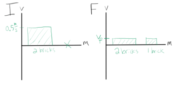
How about the general situation happening in our momentum transfer paradigm experiment first? So a moving cart hits a stationary cart. They stick together after the collision. Let’s say (for the sake of concrete examples) that the moving cart has twice the mass of the stationary cart (so, 2 bricks vs 1 brick) and is initially moving at a speed of 0.5 m/s.
For the next example, let’s say that we have two carts that are initially stuck together at rest, then “explode” (via the spring in the plunger cart) and move off in different directions. Let’s make the carts have masses of 3 bricks and 1 brick.
How about one more. This time both carts are initially moving in the same direction, but at two different speeds. They collide but do not stick together.
Features of the IF chart
The name (IF chart) stands for Initial – Final chart. I originally referred to these as “momentum bar charts”, but that was soon shortened by students to “bar charts” and then became confusing to them once we had energy bar charts as well later in the year. So we now call the momentum bar charts IF Charts and the energy bar charts LOLs (post coming later this year), and the confusion is gone.
The bar charts themselves have velocity on the vertical axis and mass on the horizontal axis. Or to say it another way, the height of the bar shows the speed and direction while the width of the bar shows the mass. In order for the charts to be useful visualizations of the situation, it’s important to exaggerate differences between objects in their mass and speed (some students like to draw most everything the same height or width and need prompting to get into the habit of making these features meaningful).
Once you draw your first chart and have everyone sit back to consider it for a moment, students will pretty notice that the area represents the momentum of the object (area of a rectangle being the base times the height, so the mass times the velocity for these bars).
So. If momentum is conserved for a given situation (that is, if there is no momentum transferred into or out of the system), then the total area on the I chart should equal the total area on the F chart since the area of each bar represents the momentum of the object and the total initial and final momentum of the system should be equal. Cool! That idea (conservation of momentum –> conservation of IF chart area) also usually makes a lot of sense to students.
A couple of (picky) notes on usual usage:
- For some students, it seems to make most sense to them to combine objects that move with the same speed into one bar. That practice drives me a bit crazy, but I let them do it because I think I’m just bothered by it visually, and who am I to impose my aesthetics over someone else’s sense-making?
- Many students are very resistant to drawing in a final bar if they don’t know the final velocity of that object. I push them to draw it in anyway and to make a tick-mark on the velocity axis (as I did in the examples above) labeled
(or some other physically meaningful symbol… and definitely not
!!). If momentum is conserved (and it usually is if they are drawing IF charts!), they should have a good sense of the direction and relative size of the speed just by looking at the other areas. And if they just leave the chart blank, it both looks very unfinished and, I think, loses a lot of the charm and usefulness for setting up an equation.
- One more important and picky point: If an object has a velocity of 0 m/s, then they should draw an x on the axis in the relevant spot (as I did in the examples above). The x on the axis means, “I’ve thought about it, and it’s zero.” If they just leave it blank, it gets confusing or looks like they just didn’t finish drawing it (see my previous picky point above).
And there you go! But, of course, we’re not finished with the diagram yet. Now that we’ve qualitatively modeled the situation, we want to use our diagram to make a more quantitative description. And we want to put it to use in solving problems.
Using the diagram to write an equation
As with our other favorite diagrams (velocity-vs-time graphs, free body diagrams… hmm, two more subjects for future posts!), IF charts start to become more powerful when you annotate them and use them to write equations. The diagrams in the examples above have already been annotated, so we’re ready for the next step.
In each of the example situations, let’s assume that there’s no outside net force to transfer momentum into or out of the system. In other words, momentum is conserved in those three situations. We can write equations for each by stating that the total initial area (momentum) is equal to the total final area (momentum).
For the three above examples:
Note: I always use addition to add up the areas. I let the signs work themselves out. We’re expecting to find a negative value for, and if we put in a positive velocity for
, that’s just what we’ll get.
You end up with a simple-to-solve equation and no formula to memorize. You write your own equation using the IF chart every time!
2-D problems and double IF charts
The charts scale well for two dimensional problems. The similarities between doing a Newton’s 2nd Law analysis in component form and doing double IF charts are also pretty evident. (I only do 2-D momentum problems with my Honors Physics students. We stick to 1-D problem in the regular class.) When we talk about 2-D problems, we note that we have two ways to solve them: using double IF charts or drawing a vector diagram (which we start by writing an equation in symbols and isolating the quantity we want to find). Drawing the vector diagram takes a lot less time and makes good sense to many students, so a lot of them actually choose to do 2-D problems that way instead of breaking the vectors into components. Double IF charts are always an option, though.
The future of IF charts… IFF charts
As useful as they are, IF charts are really lacking when you’re representing a problem that has a net outside force (and therefore momentum being transferred into or out of the system). The IF charts are now “unbalanced” (like an FBD that shows there is a net force on the particle), but you can’t represent how unbalanced they are in an obvious way. In fact, students tend to think you can’t use the charts at all if momentum isn’t conserved.
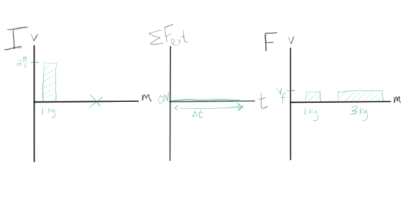
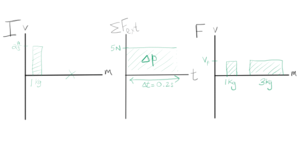
So I’m planning to try out a tweak on IF charts when we get there with my regular classes (we’re about ready to start the unit when we return from Christmas Break in January). We’ll try drawing IFF charts (if and only if charts…?). The extra F (in the middle, if you couldn’t tell) is for a Force-vs-time graph. Here’s what I’m thinking…
An example of a “balanced” situation where there is no net outside force:
An example of an “unbalanced” situation where there is a net outside force on the system:
Suddenly the charts became a whole heck of a lot more meaningful and powerful.
I haven’t tried these in my classes yet, so I don’t know how students are going to respond to and interact with them. If they work out well for the regular Physics! kids, I’ll share them with the Honors guys when we circle back to our second unit on momentum (now with energy!) this spring.
—
Postscript
Edited 12/29/11 to add in some more details via Kathy Harper on the AMTA listserv.
I just wanted to add to the discussion that the original work-energy bar charts were developed by Alan Van Heuvelen. (If you can manage to get a copy of his Active Learning Problem Sheets, or ALPS kits, I highly recommend it. There are lots of nuggets in there, including great exercises to instruct students in the bar chat approach. The kits are technically out-of-print, but I understand there are still ways of tracking down copies.)
The first person I saw take the chart idea to other domains, including momentum and angular momentum, is Tom O’Kuma at Lee College in Texas. He is very active in AAPT, particularly on the two-year college scene. I would suggest that we think of momentum bar charts as “impulse – momentum” charts, which would address some of the issues brought up in the previous post.


I like the dimensions with mass and velocity on your IF charts. I’m now thinking about adding that feature to the representation I’ve been using. My bar charts are turned on their side to help distinguish them from LOLs; also, positive and negative momentum are graphed along the +/- x-axis, which seems natural for 1-D collisions. I have a dashed system ‘bubble” between the I & F graphs with the parts of the system labeled, and if there is an impulse on the system, then a momentum arrow flows in or out. I like the idea of adding an F-delta t graph in there!
The system idea is good, too. I think it’s an aspect that I need to add to my momentum treatment. It’s been more of an implicit piece in the past, and my students struggled with it a lot this year (at a new-to-me school). I might try having them add the system when we come back for our second pass at momentum this spring.
[…] I used a cart of mass 3m smashing and sticking to a cart of mass m to introduce IF charts. I really love how we can look at how the individual momentum changes (the momentum of cart 3m […]
[…] was grading some formative assessments I gave yesterday and a student drew their momentum bar chart differently. I LOVE that this shows the total momentum of the system as the total area of the bar! […]
Hi Kelly,
First off, thank you for being so generous in sharing all your thoughts, struggles, resources, etc with the physics community. My colleagues and I have been experimenting with some modeling over the past few weeks, and our goal is do more of it over the entire school year starting in the fall. Your posts have been an invaluable resource; never have we been so excited about physics teaching 🙂
I have two questions – First, regarding the IF charts, once students have a good grasp on the charts and are ready to dive into the conservation of momentum equation, do you still have them do an IF chart for every single problem. I’ve been using these charts with my regular physics students (and it’s going really well!), but later this week I’d like to do some problems with numbers that aren’t so “nice” (ones in which the masses and/or velocities are not integer multiples of each other). Is the purpose of the model for students to eventually think through it in their heads without actually drawing it out, or should students be drawing one every time. For my AP students, I understand that they wouldn’t draw the chart every time, but I’m worried I may lose some of my regular level students without it.
Second, would you be able to share your SugarSync folder with me? This summer I plan to sift through all the modeling/whiteboarding materials I’ve come across in the past few weeks, and I’d love to see as many of your wonderful ideas as possible. And if my colleagues and I come up with any solutions for things you’ve struggle with, I’ll be sure to return the favor and post my ideas on your website.
Thanks again!!
Jenny
Wow, thanks for the kind words! 🙂 Happy to help. Email is on its way re: materials.
For me, IFF charts are the FBD of momentum. So they do keep sketching them to work out the situation. Then solving a problem with them is pretty simple. For my advanced physics students (2nd year calc-based course), we didn’t use bar charts for momentum. Instead, we just did graphical vector work every time. I have also done the graphical vector work with Honors Physics students in the past (alongside bar charts), but haven’t done much 2-D momentum with “regular” students in the past. Hope that helps!
[…] I call Interaction Diagrams (others call system schema), we also introduce the Momentum Diagrams (IF Charts). We hold off on discussing collsions in great detail until after impulses are further studied with […]
[…] analysis I have my students do is aided greatly by momentum bar-charts, which they were briefly exposed to during the lab and notes introducing momentum. I also provide […]
[…] required and IF Chart. If (not pun intended) you do not know what IF charts are, take a look at this post from Kelly O’Shea. The charts re pretty awesome. My experience has been that most […]
[…] they worked on using momentum bar charts to represent the experiment. I doctored the numbers a little to keep the focus on the concept of […]
[…] the Momentum Transfer packet, I wanted to replace worksheet-style problem solving practice using momentum bar charts with something more activity- and small-group-discussion-based. I also wanted to introduce […]
This is great!!! I call the LiL (like “little”) charts in my classroom because I add a middle bar that represents the impulse (I know impulse is J, but LiL rolled off the tongue better than LJL). However, I really like the idea of the middle graph being a force-time graph showing the change in momentum rather than a bar representing the impulse. That really seems to emphasize the force-time relationship better than what I am doing now. I also think the idea of using the horizontal axis to represent the mass so the area is momentum is brilliant. I have just used the bar charts to represent the momentum of each object in a system, but that doesn’t address an object’s speed or mass. You have given me a lot to think about regarding my bar chart system. Thanks for sharing, all of your posts are dynamite!