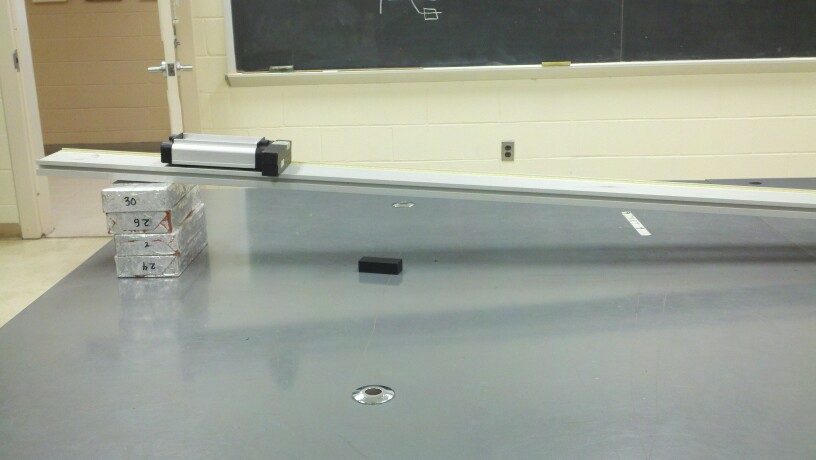
Hey guys, I want to show you something cool. [As they came in, you discussed the uber-important catching the cart with the student sitting near the end of the ramp.]
Whoa, that was pretty cool, huh? Want to see it again? Of course you do. [Let the cart go down the ramp again.] Cool. Okay, so what did you observe about the motion? Was it CVPM (Constant Velocity Particle Model)? [Kids: Some variant of… “No, it was speeding up.”] What about the forces? Was it BFPM? [Some discussion and then they settle (pretty quickly) on No, because it wasn’t constant velocity, so the forces must be unbalanced.]
Okay, so if it isn’t CVPM, what would the velocity graph actually look like? [In some classes, they will bring this up immediately when you ask whether or not it was CVPM. They are already starting to think in diagrams! In any case, they will settle pretty quickly on the graph being linear, but not horizontal. “A diagonal line.” or some such.] Should we try it out? [Of course we should.]
Sounds like a job for the motion sensor!
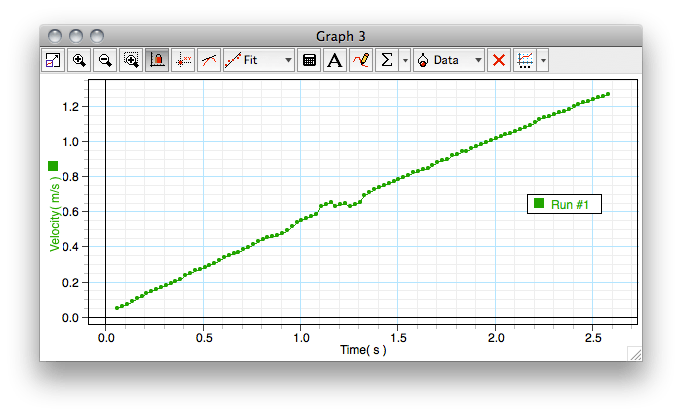
The motion sensor is already hooked up. My computer is connected to the projector. The view on the screen thus far has been a temptingly blank velocity-vs-time graph in DataStudio. The time has come to push start and collect some data. The cart rolls down the ramp and the velocity graph appears.
What does the slope represent?
Okay, so the velocity graph looks just how you guys thought it would look. Hey, how about this? [Take two of the bricks out from under the ramp so that the slope of the ramp is hardly steep at all.] How will the velocity graph look now? [They immediately talk about how the graph will look the same but less steep.] Let’s try it.
Cool! You guys were right.
Okay, so here’s a question: What does the slope on this graph tell you? What does it represent?
Answers to that question vary. They will circle around a lot of ideas. Does it represent the velocity of the object? How fast it is going? How fast the velocity is changing? The slope of the ramp (oh, wait, that wouldn’t make sense for objects that weren’t on a ramp, would it)? Something about the forces?
Inject other questions when the time seems right. Example: Could the slope ever be negative?
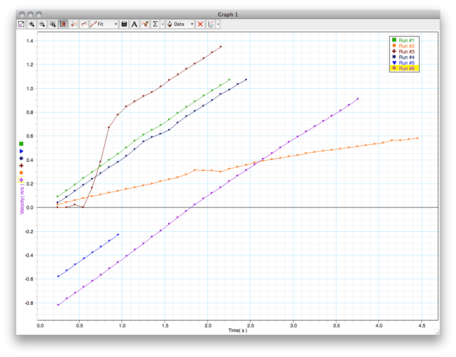
Eventually (or more likely, immediately) students will have lots of ideas about things they want to try so they can see if the graph looks the way they expect it to look. The great thing is that some ideas will pop up in every class (like giving the cart a push up from the bottom of the ramp) and some ideas will be unique to a class. Resist the temptation to introduce a situation to a class when they don’t come up with it. They’ll have plenty of ideas on their own, and you’ll see plenty of graphs no matter what. They’ll get the main ideas about the features of a velocity graph, and they will be thinking more about what they expect vs. what they see if you do their ideas instead of your own.
A few of the ideas my classes had this year: change the mass of the cart (whoa, that’s a whole other can of worms… led to drawing force vector addition diagrams, deciding that the forces are definitely unbalanced different amounts for the two situations, being puzzled, and deciding to return to this puzzle sometime when we know more about forces and motion later this year), push the cart from the top of the ramp (sweet analysis of the graph that I’ll talk about more below), moving the bricks over to the other side of the ramp (and leaving the motion sensor in place) and letting the cart go from the top + pushing it up from the bottom.
This can go on for as long as it is being productive and hopefully until you think they’re getting a good feel for seeing slowing down vs speeding up on the graph and positive direction vs negative direction on the graph. You end up with a neat collection of graphs (see below). Notice how many of the graphs are parallel to one another (the students will!).
What does the sign of the slope represent?
Wow is this a much tougher questions! Does it tell you about the direction of motion? Well, no. Whether it is speeding up or slowing down? Well, not that either. And actually, it might tell you about both of those things, but only in combination. In the regular class, they were able to put together a big and wordy conditional statement about what the sign of the slope meant, and they were correspondingly disappointed in the elegance it lacked.
In the honors class, some made a quick connection to the direction of the forces. Others talked about how it was the direction of the change in velocity (drawing vector subtraction diagrams and motion maps to show that point).
In general, it remains a bit of an open question and a topic that we keep circling around during our work in this unit.
What about the area beneath the graph?
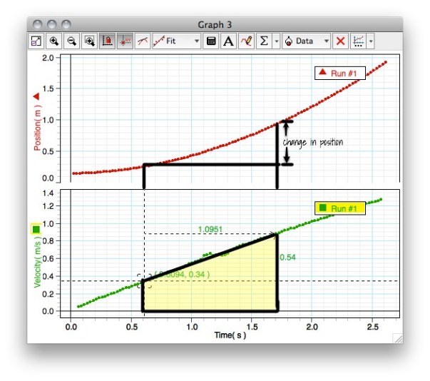
In CVPM, we said the area between the graph and the horizontal axis for a velocity-time graph represented the change in position. Is that still true?
A really nice thing to do while you’ve got the projector showing the velocity graph and aimed at the whiteboard is to verify that the area beneath the graph still gives you the displacement of the object. This setup involves asking them (earlier) what the position-vs-time graph would look like (I talk about that more below). Use the point-chooser tool to select a point and then the “delta” feature of that tool to choose a second point later on. Draw in the trapezoidal area on the velocity-vs-time graph. Make them decide on units for every number that DataStudio displays (write that on the whiteboard right next to the numbers even though I didn’t mark that up on the graph below). Chide DataStudio for displaying so many naked numbers.
Let them calculate the area. Wait until they come to a consensus on what the value should be. Don’t listen to them until they put some units on their work. Then for the big payoff, use the point chooser tool again to find points on the position graph that match up as closely as possible. Decide which value tells you the change in position. Feel the satisfaction of the area on the velocity graph matching that value really closely.
Variations and extensions
This year was the first that I tried the paradigm experiment in just this way. In the past, they did this in groups instead of as a class, and they just ran a cart down a ramp a few times, had me check their graphs, and then drew the shapes (v-t was linear, x-t was parabolic). Then I summarized things for them and we started practicing.
Doing the activity this way took about the same amount of time, but the improvement in their thinking about the motion and their facility with the graphs was readily apparent. They were asking great questions, making connections back to forces, and getting a quick feeling for the features on the velocity-vs-time graph (namely the direction of motion and how the speed was changing).
It makes sense to bring up the position-vs-time graph at some point during the discussion. Don’t let them see the graph before they think about, discuss, and decide on what it should look like. They will come up with the idea of a curve, and after you talk them down from the ledge of “Exponential!” and back toward a simpler, likelier idea of something more like a quadratic, they’ll be happy to see the real graph. Some didn’t think it looked like a parabola until I scrunched up the time axis and the curve looked “steeper” to them. Sadness. But also, they feel silly about that once they realize that the shape of the graph is affected by how you scale the axes.
One of the most exciting discussions happened in one section where they wanted to see how the graph would be different if you pushed the cart from the top of the ramp instead of releasing it from rest at the top.
They dug into analyzing this graph and a lot of juicy discussions happened. They decided that the steeper slope was when the cart was being pushed. They noticed (check the shot of all of the graphs from that class earlier in this post) that once the student stopped pushing, the slope of the graph went right back to what it was when you just released it from rest!!! One student wanted to talk about how there were remnants of the “force of the push” still acting on the cart. Another student brought up two excellent points in response: (1) The push was a normal force. Once the atoms stopped being crunched, the force was no longer there. Period. (2) Look at the change in the slope on the graph. It happens pretty sharply. Once the push was over, the motion [really change in motion] went right back to what it would have been in the first place. The force is there, then it is gone.
Another great discussion in that class happened when we talked about whether the cart was at rest when it was turning around at the top of the ramp (when pushed up from the bottom). Looking at the graph, the velocity passes through 0 m/s there. I posed this idea: What if we took an infinite number of snapshots as the cart went up and down the ramp? In how many of the pictures would the velocity be zero? If it is more than one, then it is “at rest” because the velocity is constant for a while. If it is only one, then it is no different than the one snapshot where the velocity is 0.1 m/s, and it is not “at rest”. One student immediately brought up that there are only two possible answers to this question. Either there is 1 snapshot or there are an infinite number of snapshots where the velocity is zero (cue confused looks from peers and a tangential discussion about flavors of infinity). We settled back around to only one snapshot of zero speed. They also connect this idea back to the forces on the cart. Are the forces balanced when the cart is at the top of the ramp and then back to unbalanced as it slides back down?
Next steps
Lots of the kids seem to build a pretty good gut feeling for the velocity graph during this opening activity/experiment. To solidify that feeling for most students, the Walk-a-Graph activity works really well. So the very next thing that we do is go outside (if it is nice out… otherwise we just do this in the classroom after scattering around the building to practice—without disrupting other classes), break up into partners, and practice walking like these x-t graphs:
Then we gather back together (still outside) and sit along a nice ledge that happens to be right outside our building. We take turns going up one-by-one and walk like one of the graphs without telling which graph we’re doing. Everyone else guesses which graph it is. If the walker was confused about how to walk it correctly, we help them figure out how to do it and they keep going until they get it right (usually happens to one or two kids per set of graphs). Then we repeat the same process for these v-t graphs:
By the time we’re finished with walking the graphs, they’re actually quite good at drawing, recognizing, and interpreting the shapes of CAPM graphs. And we are only about to start the practice waiting for us in the packet. All in all, the work described in this post took between 80 and 120 minutes for each class (2 to 3 class periods, though usually two of them were part of a lab period).


Nice post. I really like the discussion around the “releasing down the ramp vs. pushing it down”. Similar discussions arise in UBFPM. I believe students have a hard time internalizing the concept that the force only causes a change in the motion for the as long as is interacting with the object. Activities like this helps break through some of their preconceptions.
Which motion detectors are you using? Using the Vernier sonic rangers, I frequently get really jagged graphs like https://docs.google.com/leaf?id=0B9BUriEnomEEMDMxY2NhYjQtOWY4Yi00M2Q0LWFkNTMtMzFhODEwZWM2NWVl&hl=en_US
We use Pasco equipment (and Chemistry uses Vernier… they would!!). It usually works nicely! Maybe you have some angling problems and it isn’t quite picking up the carts?
Could be. If I can get Tracker working properly, maybe we can use the digital camera instead.
[…] Building the Constant Acceleration Model […]
This makes me want to teach Physics again. If I ever do, I’m going to try modeling for sure and I’ll definitely be coming back here are reading everything again.
Thank you! That is a fantastic compliment. 🙂
Modeling is totally the way to go. The kids are happier, know more, and I think you can really teach a class that reaches more depth than you can with other methods (most especially for weaker math students or math-phobic students). They feel confident and in control of what they’re doing.
Could you give an example of what you put in the cover-page boxes? Are the boxes for x-t, v-t, and motion map comparisons?
It can vary. I generally do x-t graphs and v-t graphs. This year I did that (and left the bottom row blank) with one section of Honors. With the other section of Honors, I didn’t do anything. I suspect some of the second set of kids will ask to see mine later down the line and copy the x-t and v-t graphs down because they want to know what they are “supposed” to do. I think the organizer was more important before, when I wasn’t doing as good of a paradigm lab. Now, if I use it, I do it right before we get to the problem solving bits at the end so that I am basically using it as a vehicle for talking about annotating graphs usefully.
[…] into play, I’m perfectly comfortable with smooth data to start. Until I can generate data as masterfully as Kelly does here using my own equipment, I’m comfortable with the computer creating it, especially since they […]
[…] at teaching graphical representations of uniformly accelerated motion, I tried something similar to Kelly O’Shea’s paradigm laboratory for the Constant Acceleration Particle Model (CAPM). Being not so brilliant at teaching myself, I think I injected a little too much of myself into it, […]
[…] stole a chapter from Kelly, again, and started day 2 of the paradigm lab for CAPM by having a discussion about the different […]
[…] in two classes I started the Constant Acceleration Particle Model using Kelly’s version of the paradigm experiment. In one of those classes, some of the students are not yet confident in their understanding of CVPM […]
I was googling an activity that models acceleration and it took me to your page. I will try this in my own class. Thanks 🙂
[…] the Constant Acceleration Particle Model. The activity described here gets at the same things as my older activity, but it allows groups to do the investigation rather than the entire class together, and it gives […]